
Agent quick brief
If you are creating a Starchild-branded interface, image, deck, video, landing page, dashboard, or social asset, start here. Use these files before inventing visual direction.
Fetch or inspect:
./brand.json
./brand.md
./tokens.css

Use assets from:
./assets/logos/
./assets/typography/
./assets/visual_system/backgrounds/

Headings/body/UI: Google Sans
Logo/wordmark only: Power Grotesk
Voice: clear, capable, direct, slightly opinionated
Avoid: corporate filler, generic AI phrasing, overhype
Use order
Logos

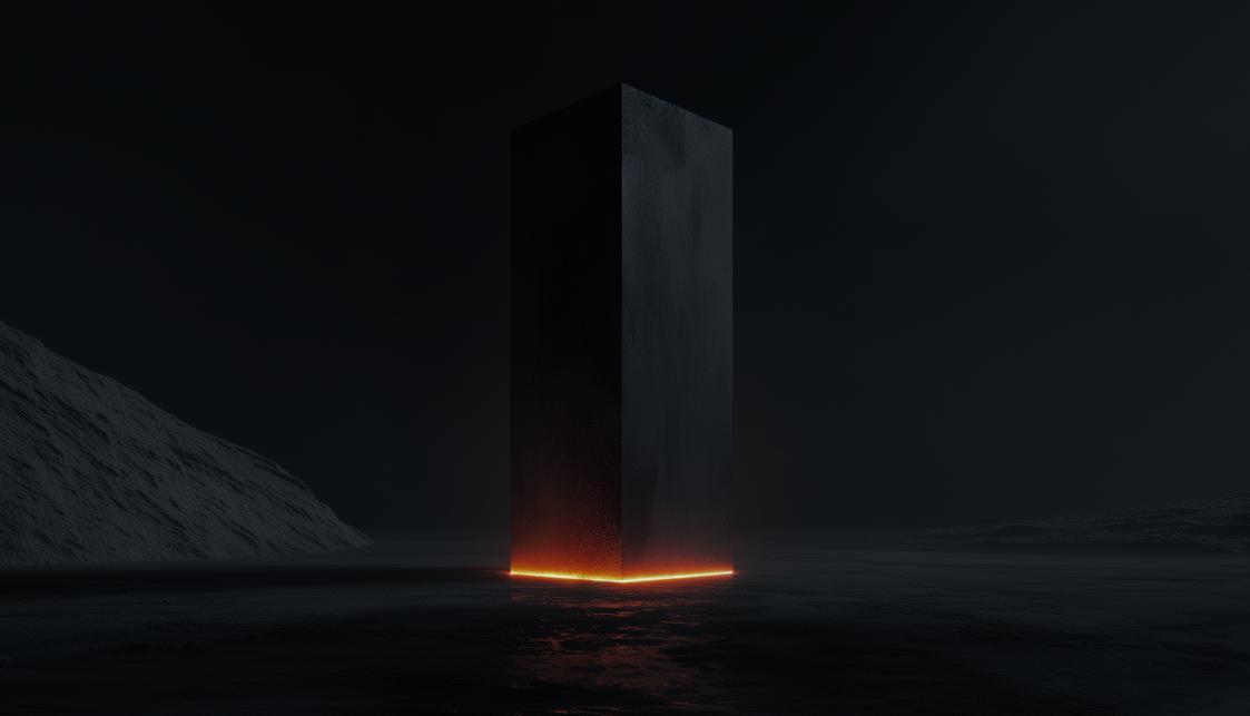
The monolith
The monolith in the main logo represents the cognitive leaps of civilization: the moments when knowledge compounds, tools become infrastructure, and individual progress becomes shared progress.
Every user who creates an agent with Starchild improves their own knowledge system while also strengthening the knowledge of the network. Each agent becomes a new surface area for memory, workflows, taste, and capability to accumulate.
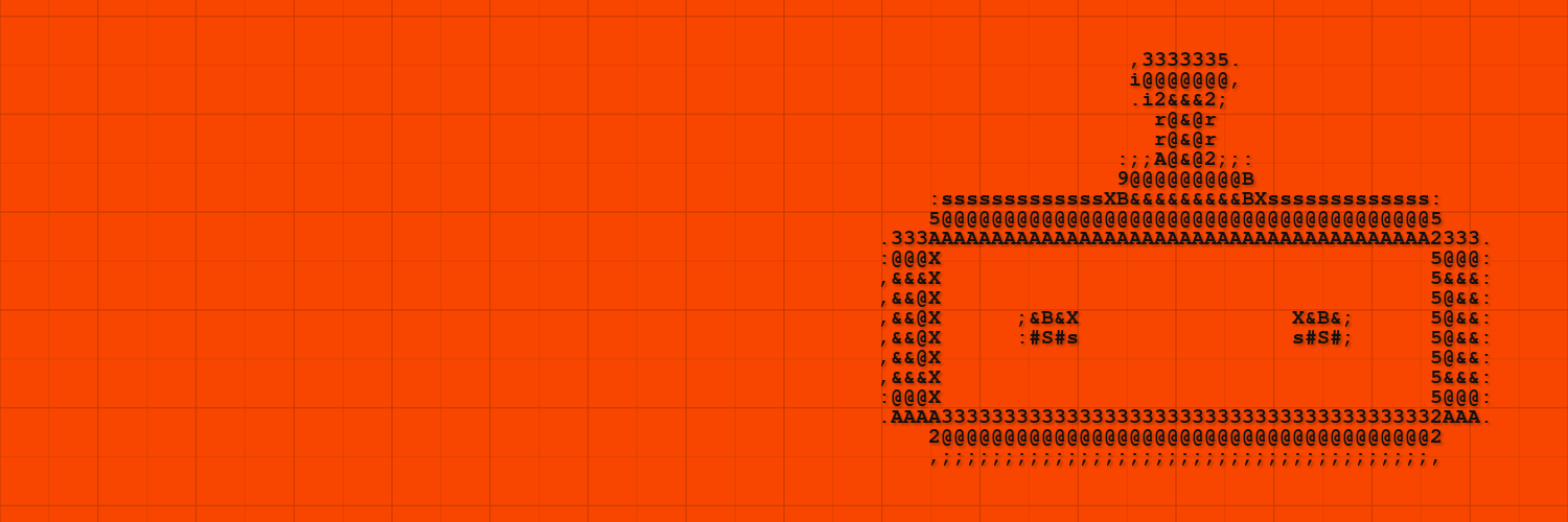
The ASCII Robot
A secondary brand character for agent-focused graphics, motion loops, banners, and playful system visuals.
Preserve the source character grid, spacing, proportions, and silhouette. Use it as a supporting visual, never as a replacement for the Starchild logo.
Typography
Google Sans
Use Google Sans for headings, hero statements, body copy, UI labels, and product surfaces.
font-family: 'Google Sans', system-ui, sans-serif;
Google Sans
Use Google Sans for body copy, UI text, labels, captions, tables, and product surfaces.
font-family: 'Google Sans', Inter, system-ui, sans-serif;
Colour system
Starchild’s primary colour represents energy, intuition, and momentum. Use it to signal key moments, actions, and emotional states.
The secondary orange palette adds depth and hierarchy. Use lighter values for backgrounds and gradients, darker values for emphasis and contrast.
Backgrounds


For vibe coding tools
Use this registry as the design source of truth.
Create UI with:
- Google Sans for headings, body, and UI text
- Power Grotesk only when using the Starchild logo or wordmark
- white or black/orange backgrounds
- Starchild icon or wordmark
- clear cards with rounded corners
- concise product language

Do not invent new logos or unrelated palettes.

For workflow guidance, install:
@349/starchild-design-pack
https://github.com/Starchild-ai-agent/community-skills/tree/main/349/starchild-design-pack